Mobidys
In collaboration with Mobidys, I had the opportunity to contribute to the enhancement of the UI and UX of the FROG Reader, an innovative platform facilitating access to existing works adapted into FROG books. FROG (acronym for Free Your Cognition) is a standardized format for e-books accessible to readers with DYS and disabilities. The main objective of the project was to simplify the use of the reader and improve the understanding of tools, while also seeking to internationalize the offering to reach a broader audience.
Role
UX/UI Designer
Timeline
5 days
Tools
Figma, Miro, Rotato
Context
Mobidys' FROG Reader is specially designed to alleviate the reading effort of individuals with "dys" disorders.
Aligned with Mobidys' mission to make reading accessible to everyone, the project was initiated within the constraints of the following brief:
5 days to rethink and improve the interface of the reader.
Main goals
🔗
Simplify the UX
Make the platform more user-friendly and easier to navigate, ensuring a seamless experience for dys users while reducing the stress of use.
🛠️
Make tools intuitive
Improve the understanding of the features of the FROG Reader, make the layout more transparent and creating intuitive visual cues.
🌍
Internationalize the offer
To meet growing global demand, internationalize the offering, adapting the interface for diverse languages.
Existing product
Following an audit of the existing product and user feedback provided by Mobidys, we have detected various areas to focus on:
- Lack of coherence in the service's identity and layout
- Excessive visual disruptions
- Overly complex UX (such as a dual menu) with significant risk of errors
- Unclear iconography
- Non-responsive interface
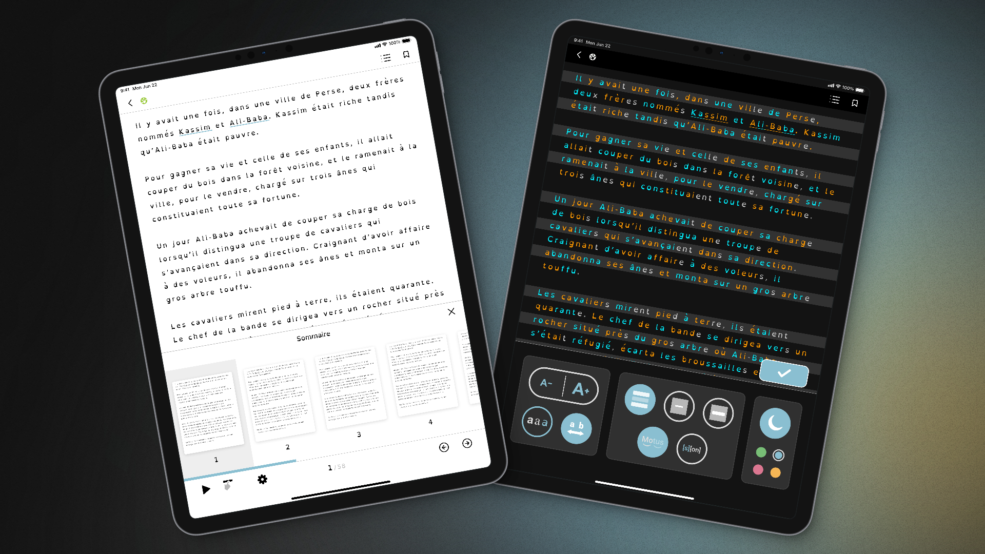
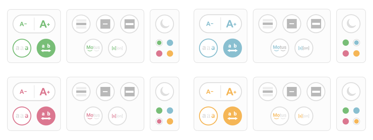
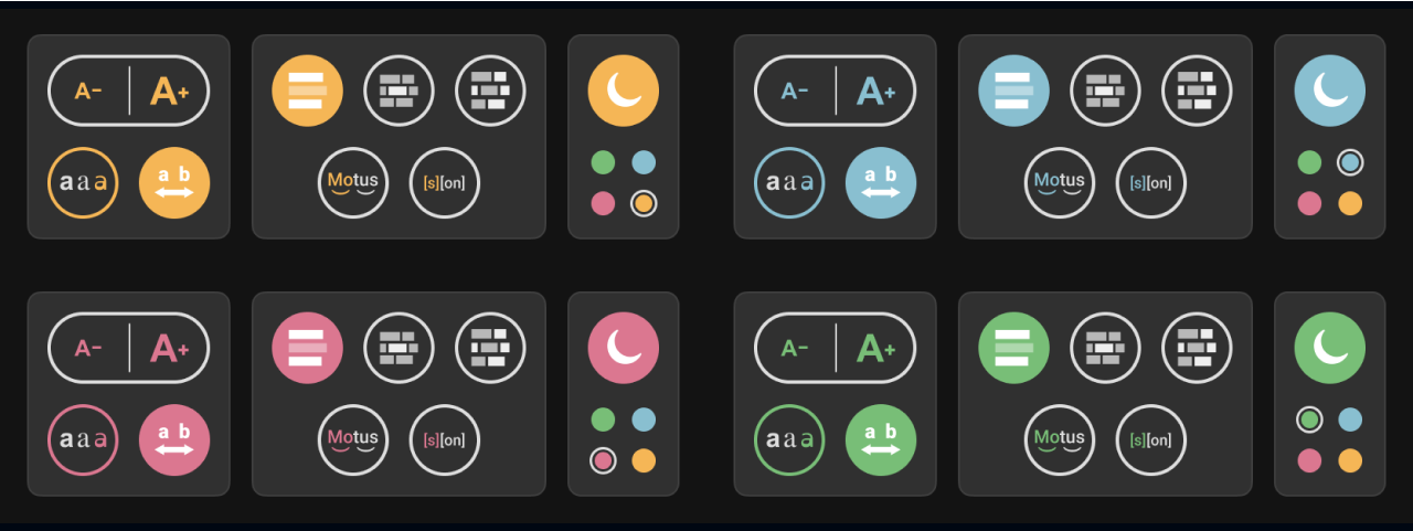
Concept Proposals
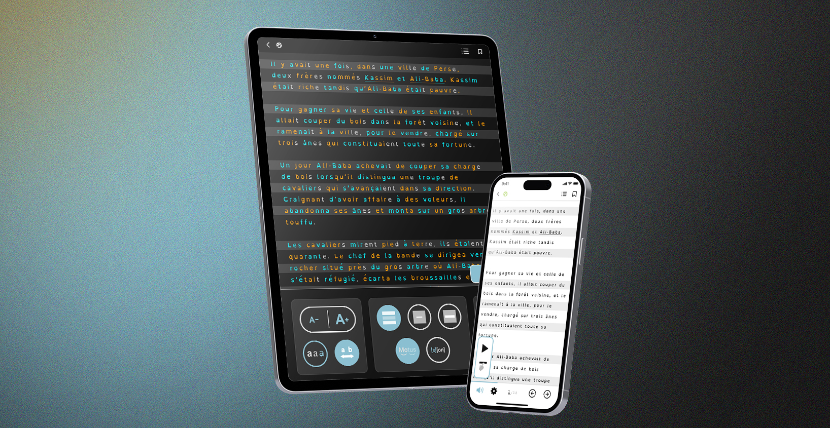
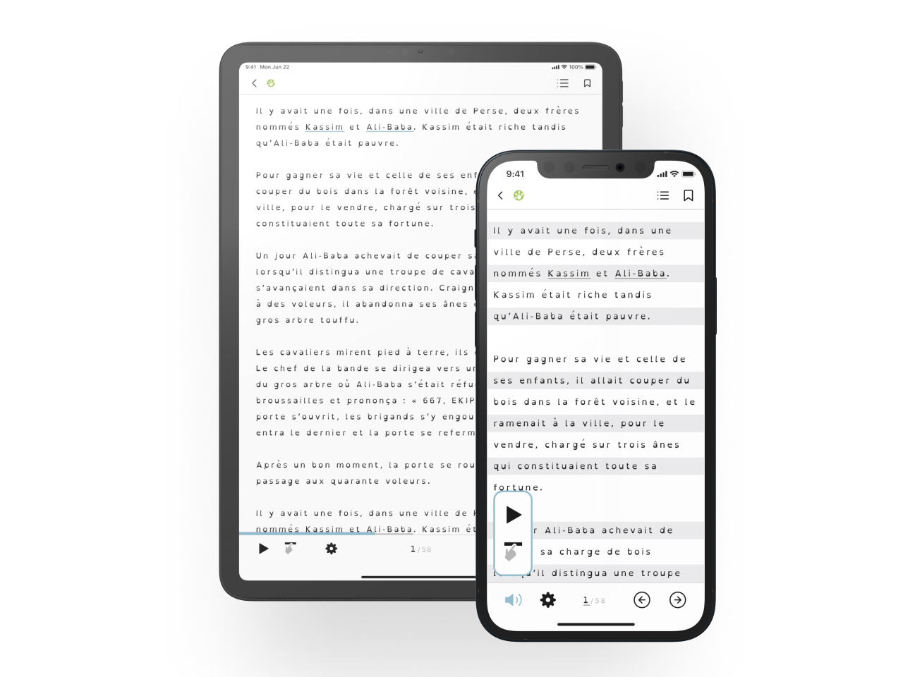
👁️
Reading Mode
Primary features placed at both the top and bottom, incorporation of a limited color palette, and integration of a select few icons to minimize cognitive strain while reading.
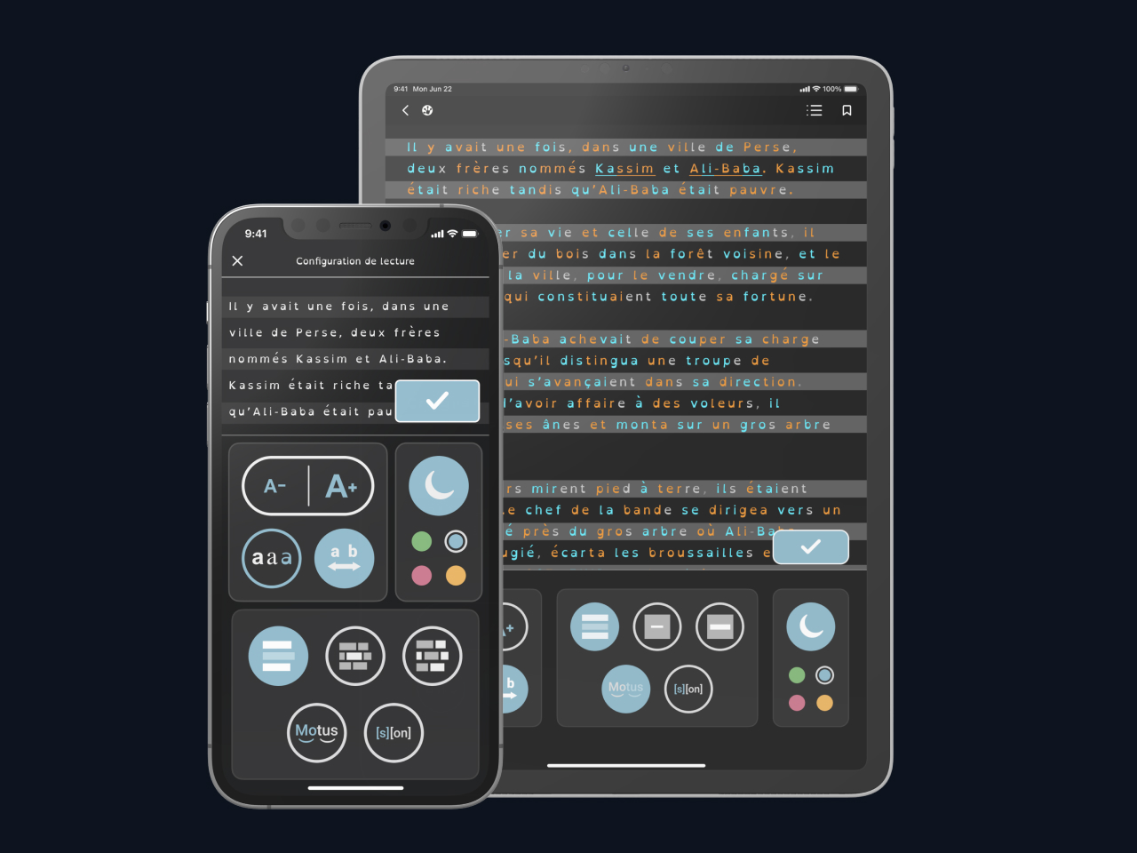
⚙️
Setup Mode
The necessary tools are distributed across three boxes: Text, Appearance, and Concentration, with the text remaining always visible to facilitate the observation of changes.
🌙
Dark Mode
Introducing a dark mode allows a broader range of use and provides an additional tool for reading comfort, by reducing eye strain and enhancing readability in low-light environments.
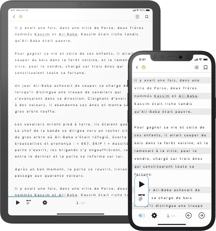
Reading Mode
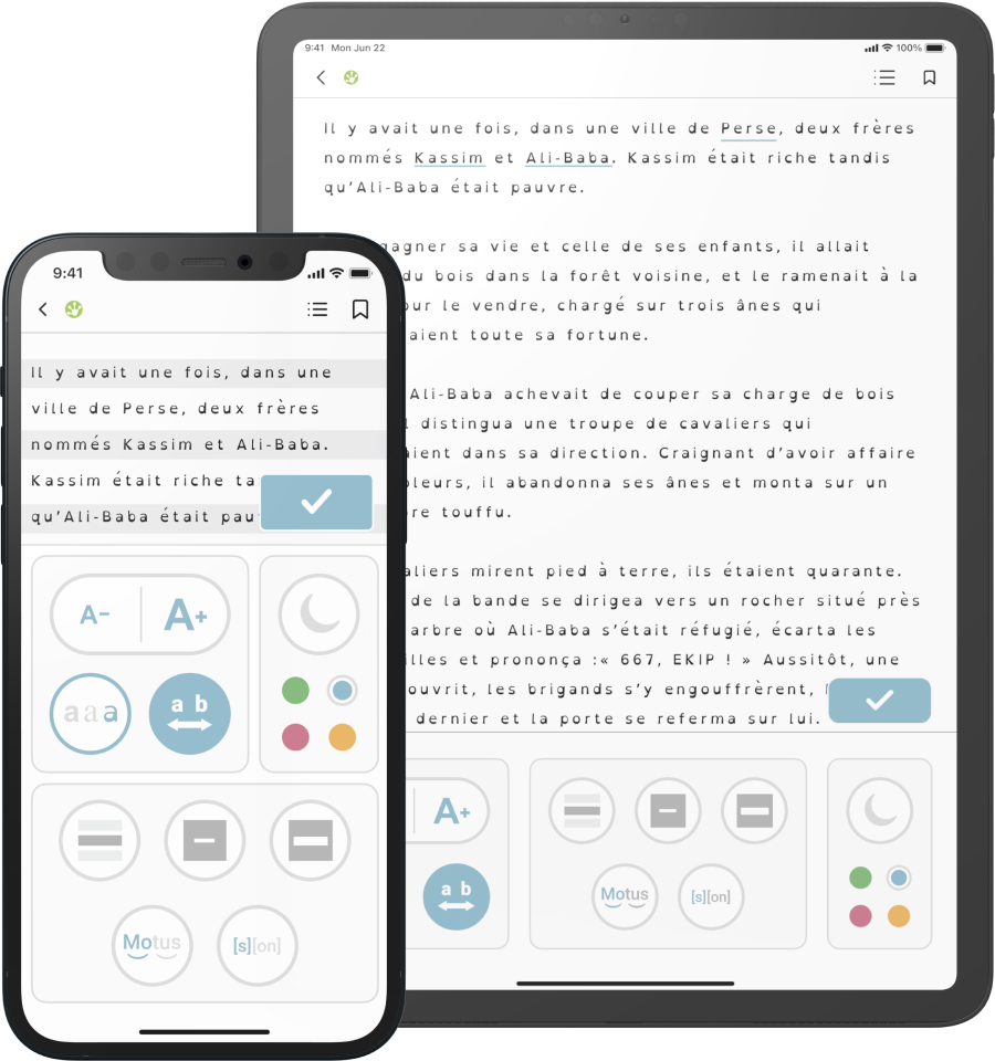
Setup Mode
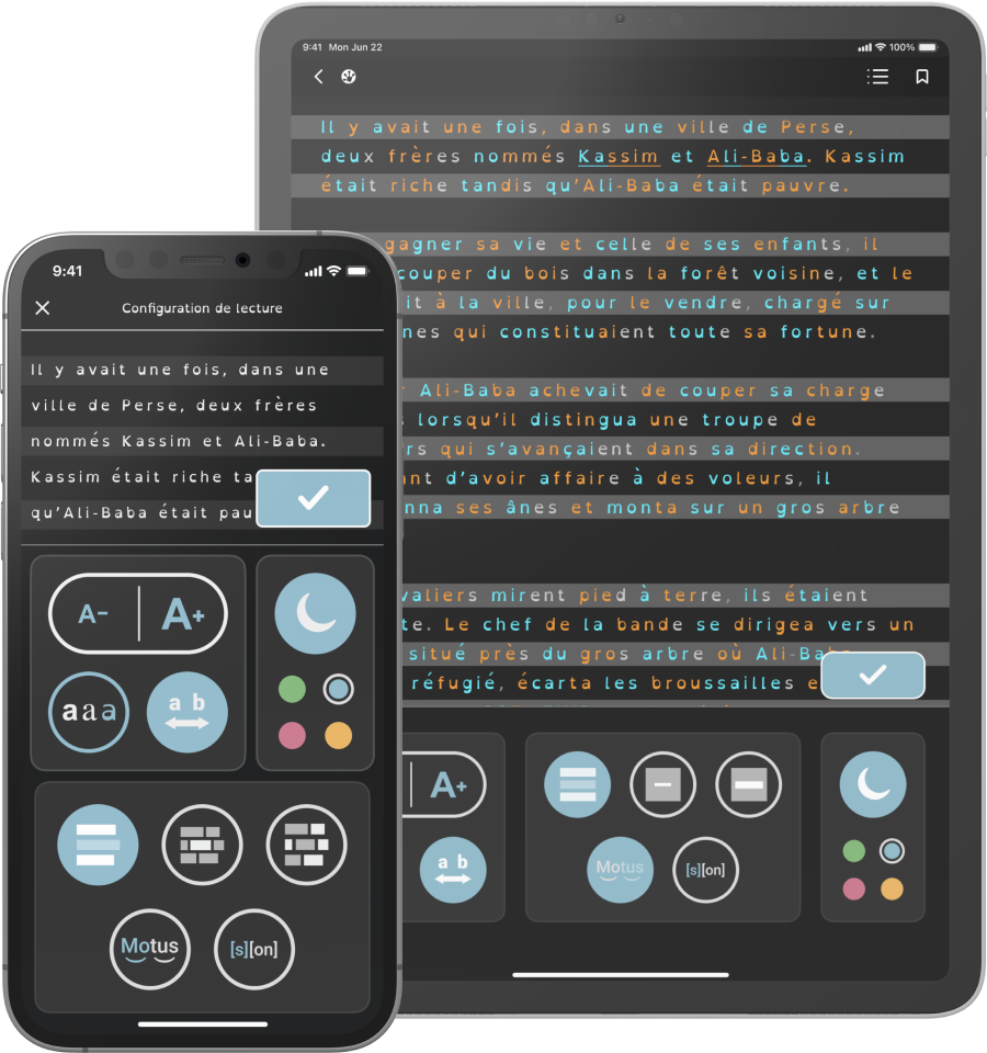
Dark Mode
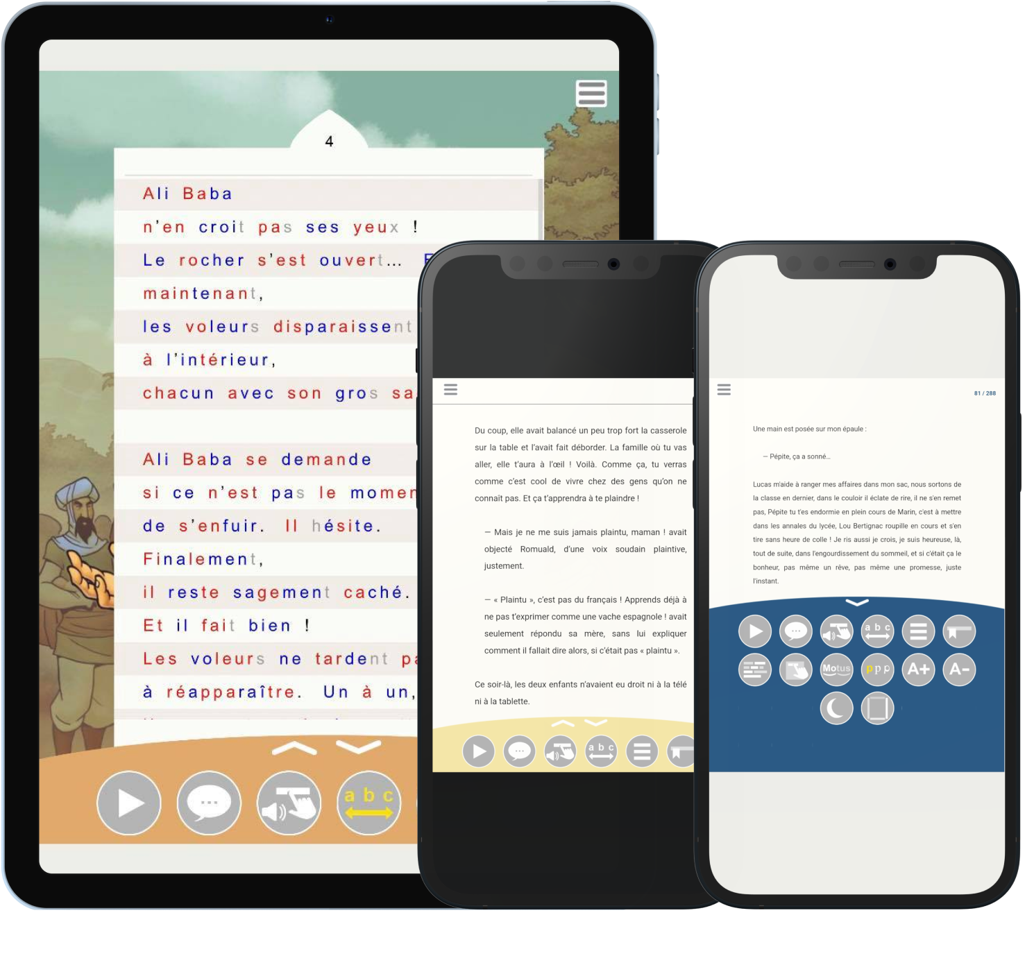
Accessible Font
Typography significantly influences readability and accessibility for readers with dyslexia.
Following thorough research, we chose the OpenDyslexic font, an open-source typeface specifically designed to enhance readability for individuals with dyslexia. This font offers a range
of styles, including regular, bold, italic, and bold-italic, making it highly versatile.
Continuously updated and refined based on feedback from dyslexic users, we guarantee the product's enduring continuity and consistency throughout updates.
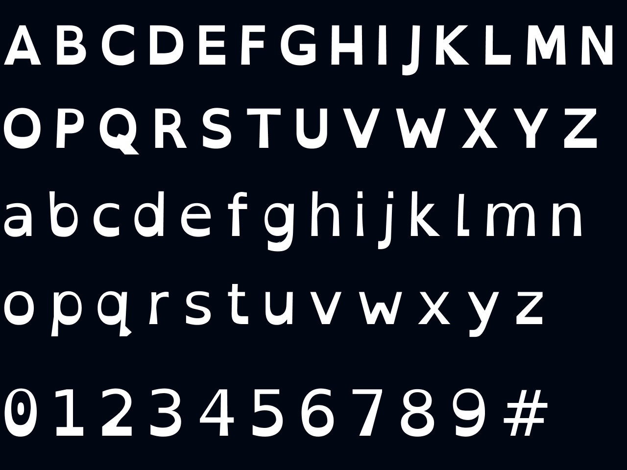
The OpenDyslexic font increases reading confort and respects the specific needs of dyslexic readers.
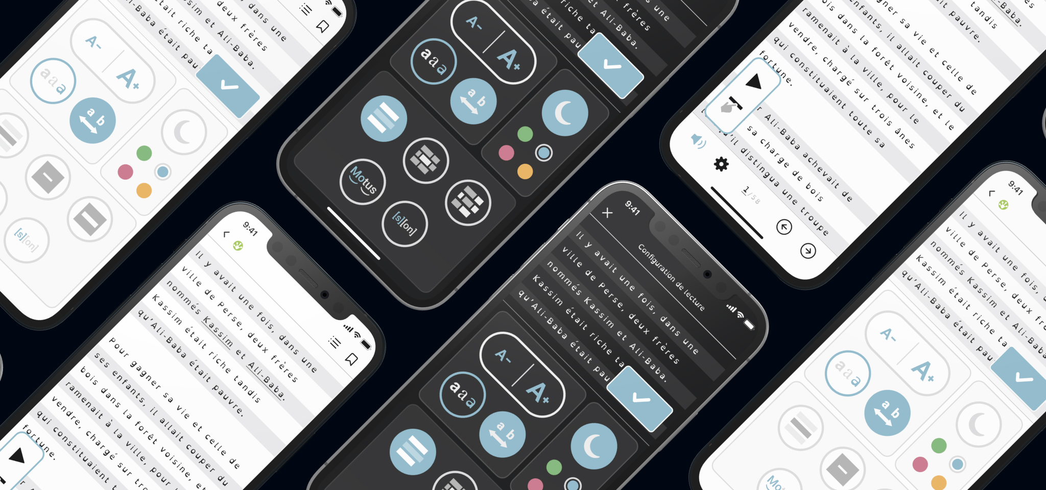
Final Mockups
Outcomes
This project was a rewarding experience, demonstrating the power of user-centered design to positively transform accessibility to reading while addressing the specific needs of a complex audience.
The Mobidys team's feedback was extremely positive, highlighting a significantly improved reading experience for individuals with "dys" disorders. Following our intervention, they improved their product by drawing direct inspiration from our proposals.